Harmonic
Identity, strategy, website, collateral and animation
Harmonic is a leading software platform indexing critical—and current—startup data, with the aim of making information around the startup universe more transparent and equitable. With more than 6 million startups and 110 million professional profiles updated daily, it’s fast become a vital database for VCs, partners, investors and influential firms, delivering essential changes as they happen. (Harmonic calls it “a Bloomberg Terminal for startups.”) Users are instantly alerted when target companies raise a round, appoint a CTO or check off an industry milestone—and extra tools, like Harmonic’s Chrome extension, quickly reveal a company’s funding history, team growth and more.
In 2022, Harmonic engaged FAY to usher the platform into a new stage of growth, beyond the realm of venture capital. Through this work the team helped reimagine Harmonic’s strategic positioning, messaging, visual identity, accompanying system and website. The result—much like Harmonic’s constantly evolving and updated data sets—is underpinned by a researched precision and bold, dynamic visual language, that applies seamlessly to motion graphics. The identity system was applied to everything from the website to motion graphics, sales collateral, campaign concepts, social media and more.
The mark is comprised of three extruded ‘data bars’—a reference to Harmonic’s expansive data sets and the company’s three key product differentiators. The forms of the mark also meet at the center, a nod to their expansive network of data that users can navigate across multiple dimensions
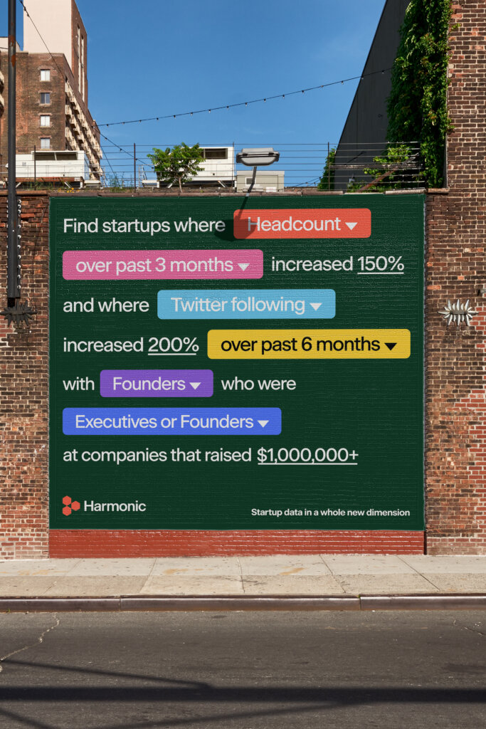
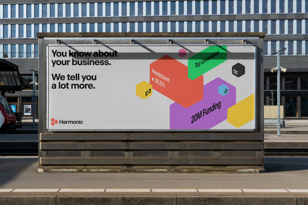
OOH concepts show the colorful visual identity at work, which here riffs off the platform’s ability to deliver robust, hyper-focused results
A value-driven messaging strategy, works in harmony with the platform’s core offerings, helping tie back to the company name
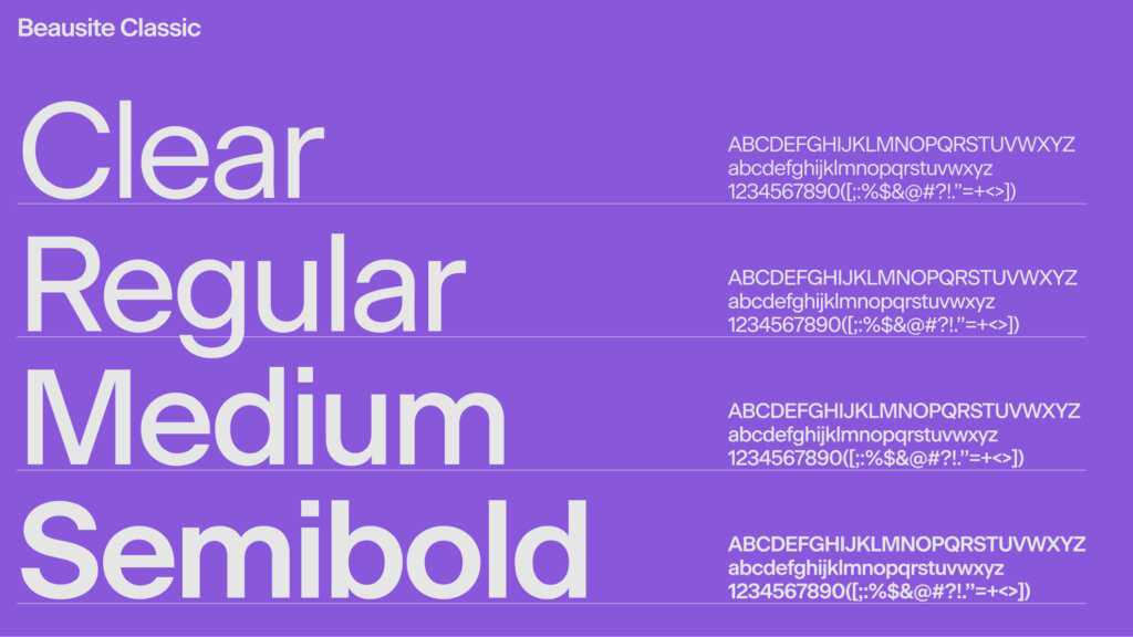
The core typeface, Beausite Classic, is neo-grotesque with a geometric twist, a perfect match for the startup sector
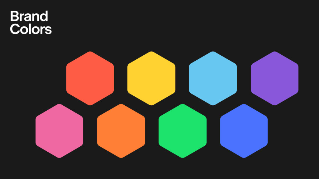
The vibrant, neon brand colors, allow Harmonic to show up in an assertive manner in the world of tech
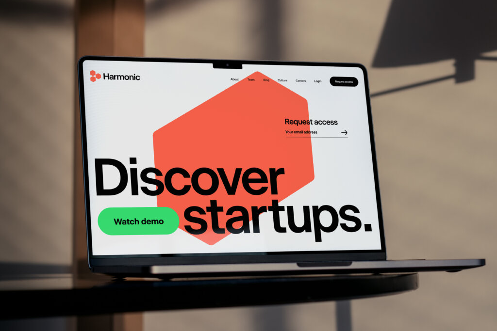
The website redesign includes dynamic animated content and illustrations
Social media templates
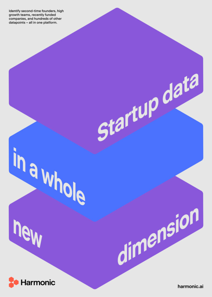
Poster utilizing the multi-dimensional visual language (derived from the symbol) as an armature for messaging
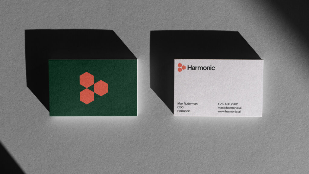
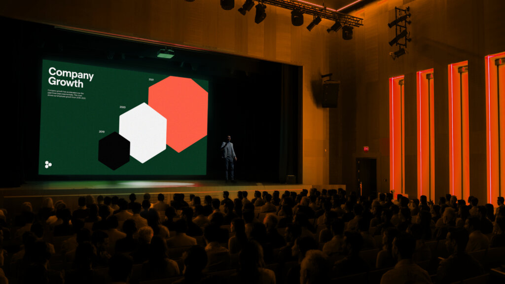
The system extending to on-screen infographics
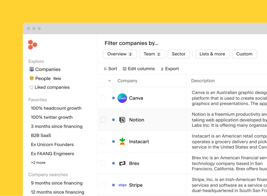
The symbol shown confidently at the top left the product
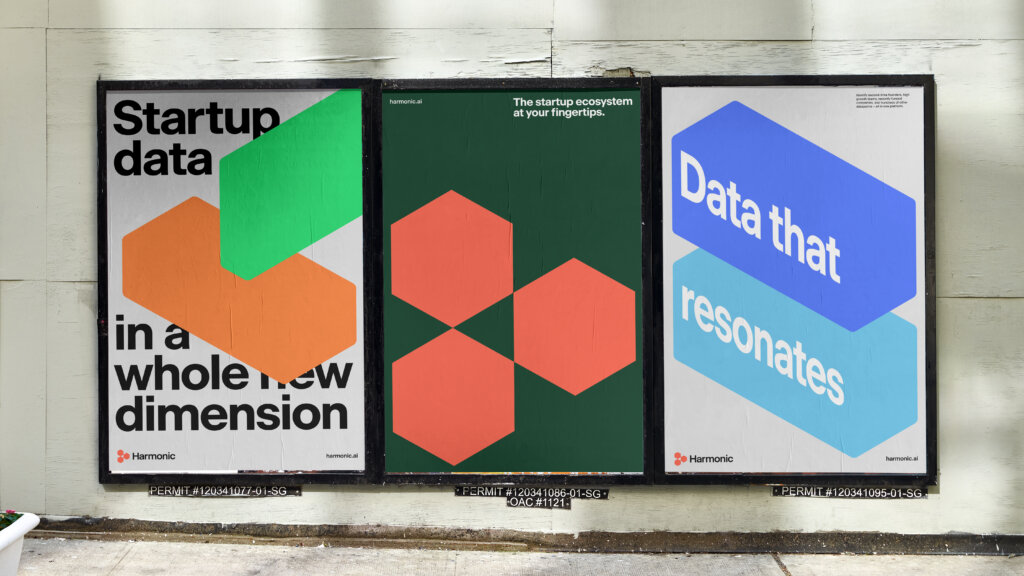
Harmonic’s visual system and messaging applied across a series of posters
Website redesign and motion graphics embody the product’s flexibility and depth

In a market driven by numbers/data-in-flux, the 3D data bars are designed to extend to a 3D infographic system

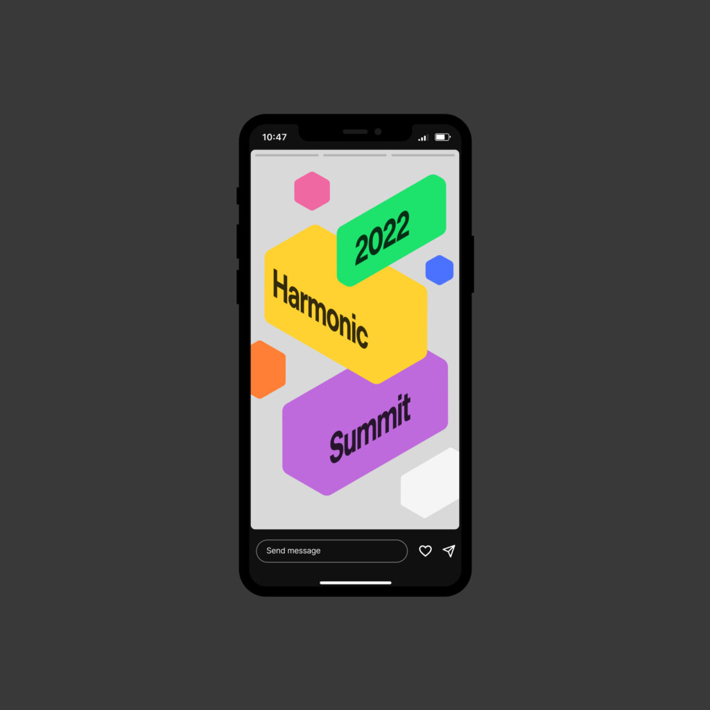
An example of the graphic motif in-use as a layout strategy
Project team
Aron Fay
Chi Hao Chang
Will Ferguson
Client team
Max Ruderman
Stephanie Lee
Nate Shirley