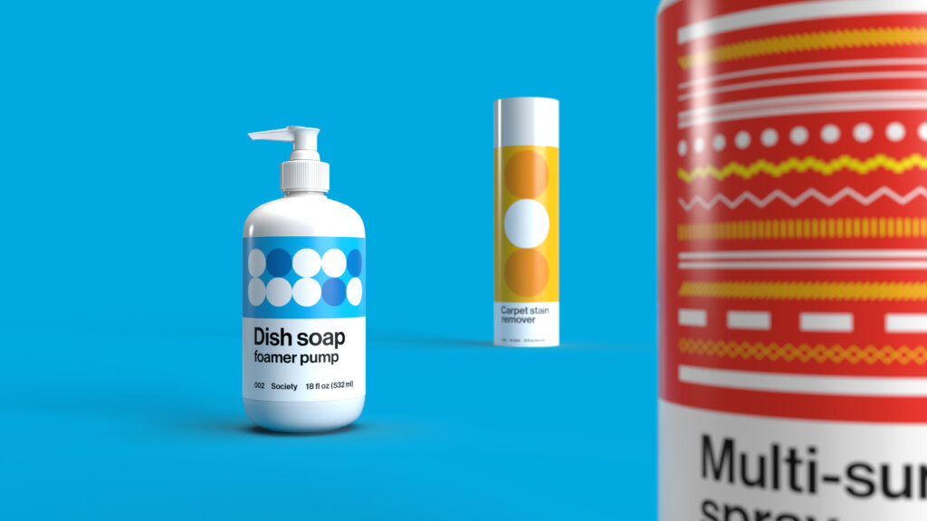
Society
Identity, packaging, website and collateral
Society is a direct-to-consumer subscription service for household cleaning supplies and home goods, selling everything from dog shampoo to dishwashing fluid: functional products that don’t traditionally enchant consumers. While not overtly glamorous, there’s a utilitarian beauty to these products we use daily.
FAY was asked to create a visual identity and packaging system for Society. The solution was based on a simple observation: household cleaning products are not typically pleasant to look at. In fact, they’re often hidden under the sink. But does it have to be like that? Can the products we use daily in our homes and offices be objects we’re proud to display?
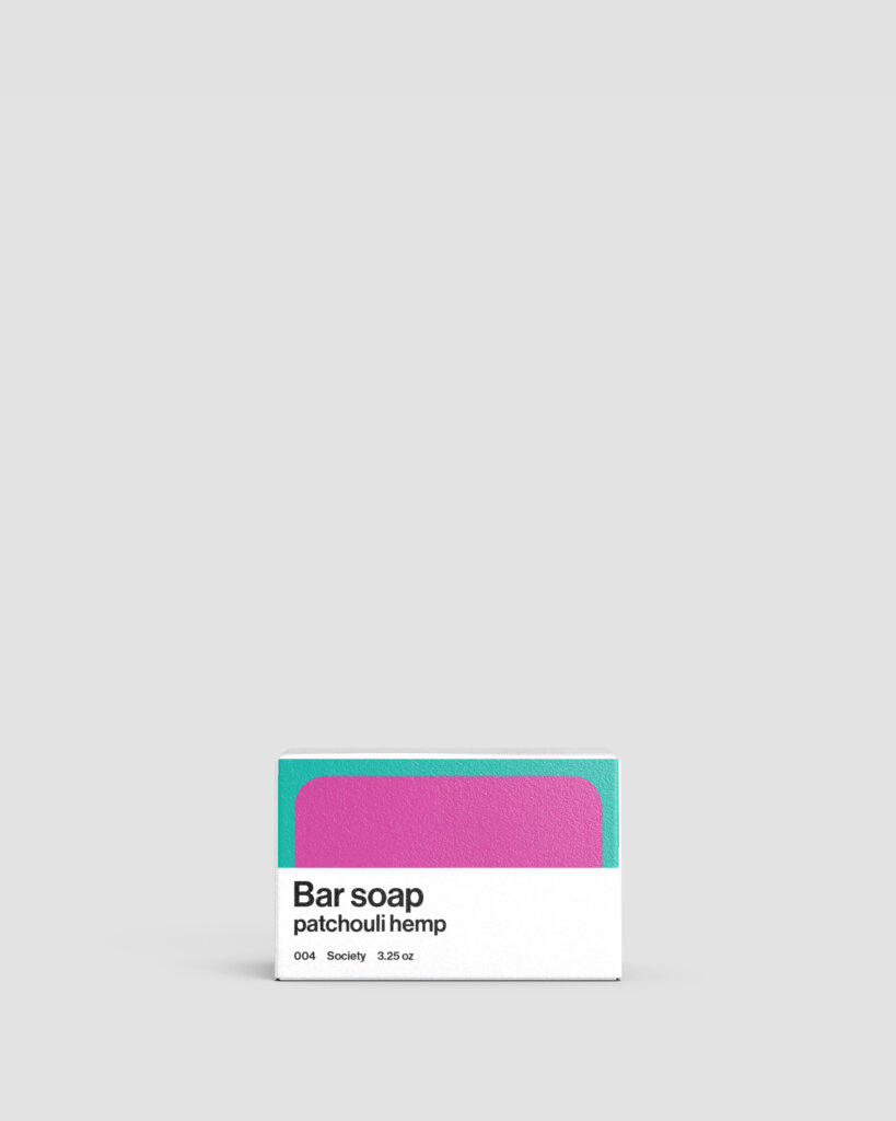
The resulting identity and packaging draws inspiration from the bright palette and bold, reductive forms of midcentury artists. Each product exterior features a distinct geometric illustration that references what’s inside: a lozenge shape for dishwashing pods, a dot-dash line pattern for multi-surface spray. On products with various scents or varieties, color is the differentiator. Monochrome type—which feels unadorned and honest—speaks to the company’s DTC ethos.
An expansive palette referencing the diverse, natural ingredients in Society products
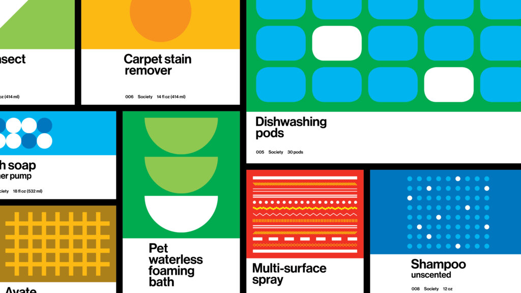
Through a persuasive use of typography, color and pattern, the packaging system is unified and replicable. Packaging can be generated quickly and stress-free, without an internal design team and for a wide range of products and product variants
Product variants, denoted by color
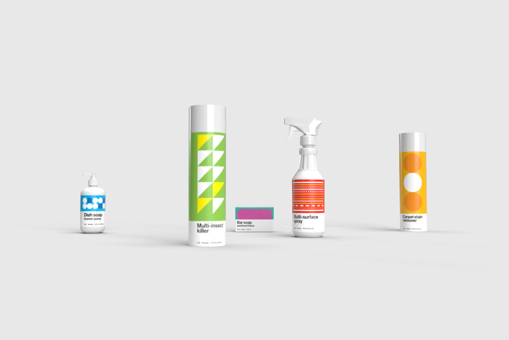
Renderings by FAY, help showcase the products simple, modern, visual language
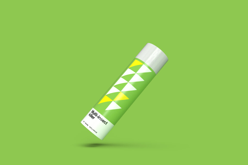
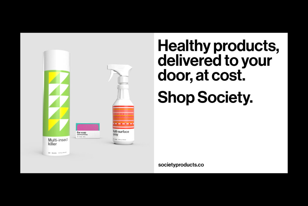
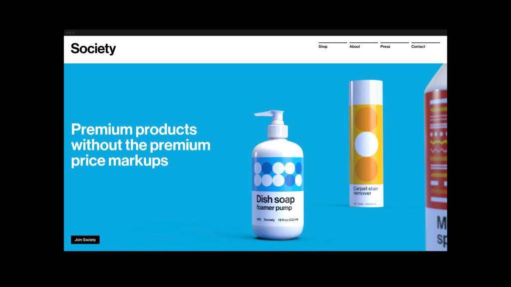
A structured digital advertisement format mirroring the packaging design style. Like the packaging, it’s also plug-in-and-play, enabling non-designers to generate elevated visuals
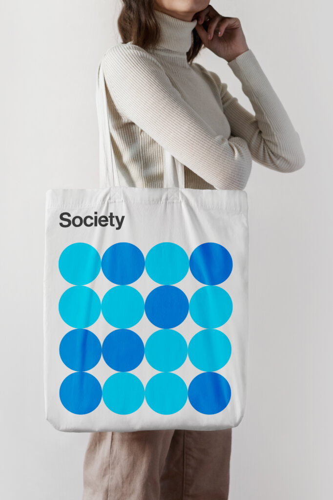
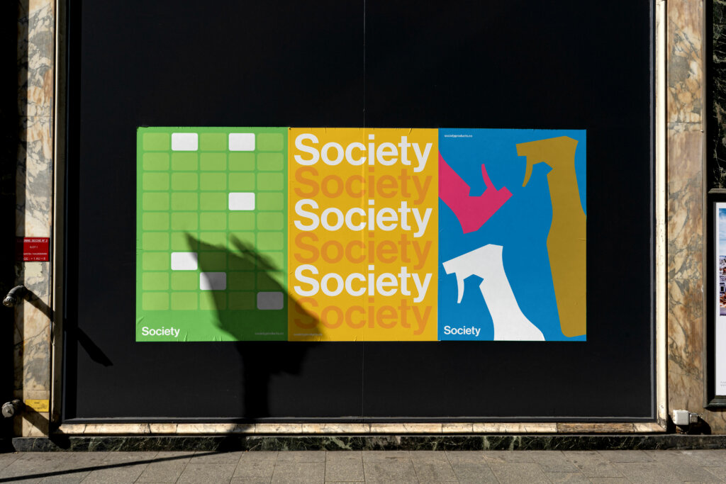
OOH posters use a colorful, and modern visual style
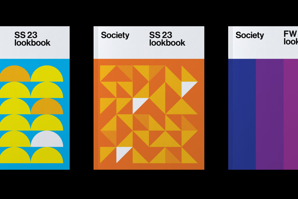
Quarterly lookbooks wipe the (industry) slate clean, showcasing products and new packaging in thoughtful, joyous ways
