
City of Mirrors
Book design, exhibition design and social media graphics
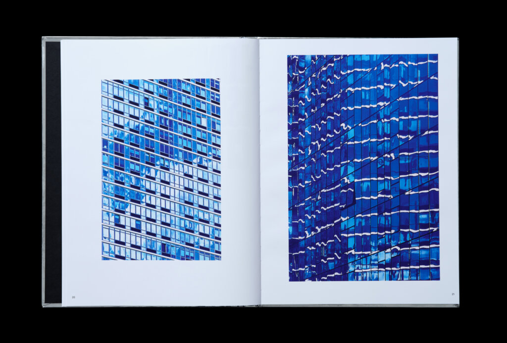
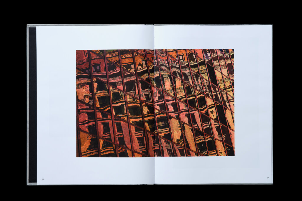
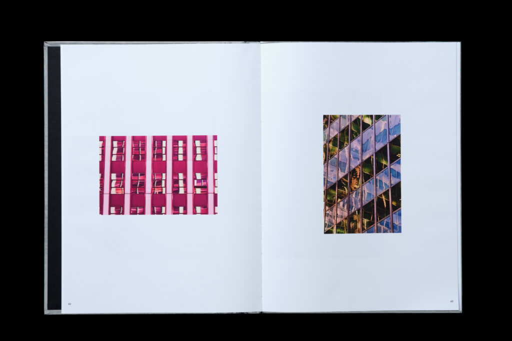
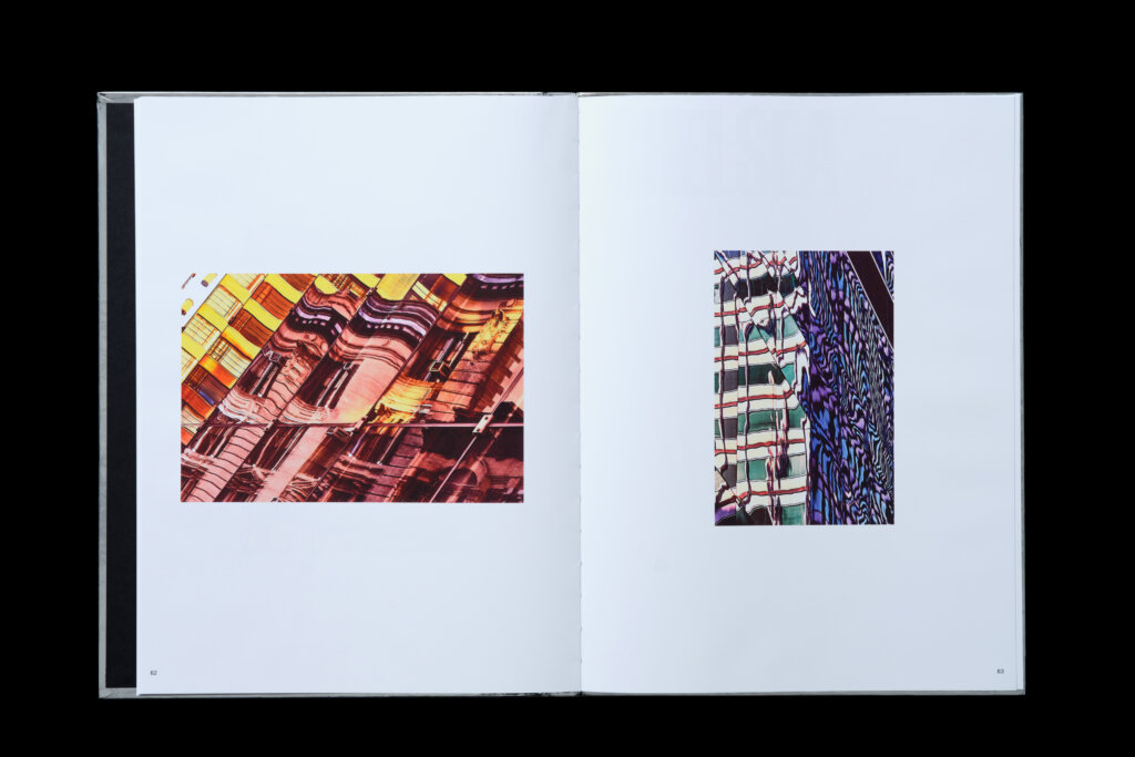
In 2019, French photographer, Pénélope Romand-Monnier captured countless images of building facades throughout New York City. The resulting series, CITY OF MIRRORS, is a document revealing the surprising, often surreal paintings generated by the layered light effects, mirrors and reflections that dance upon the city’s canvases of glass.
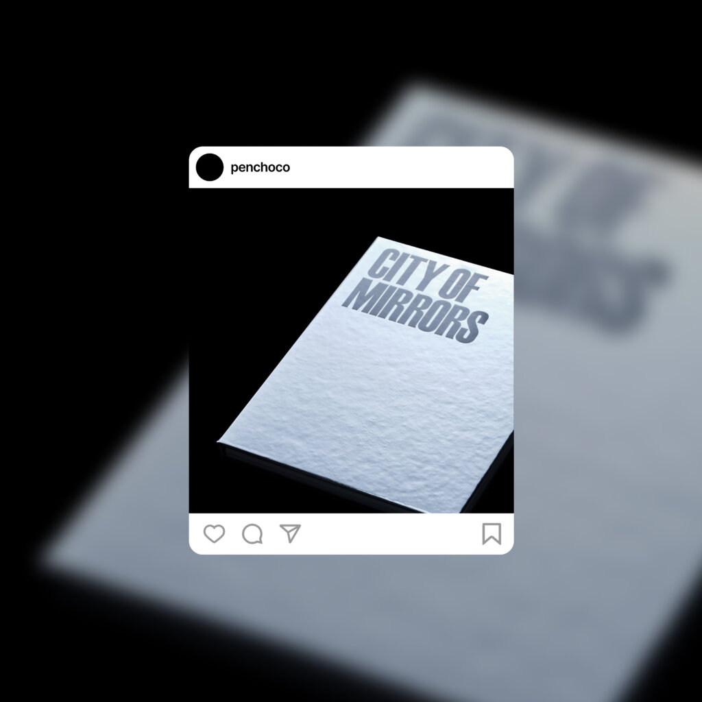
In 2021, Pénélope Romand-Monnier enlisted FAY as a partner on the project, who brought it to life in person and print. FAY started by designing a limited-edition, hardcover photo book—and advised on naming, editorial structure and print production—its statement silver cover doubling as a mirror. In addition, the studio helped with the exhibition’s graphic materials, which was held at Paris’ Espace Voltaire.
3D renderings and animations reveal the book’s physicality prior to print

Schmalfette Grotesk, a quintessentially New York typeface, is at once blocky and slender: a building in itself. Originally created in 1954 by Walter Haettenschweiler—the book & materials use a digital revival commissioned by Michael Bierut at Pentagram and realized by Jeremy Mickel of MCKL
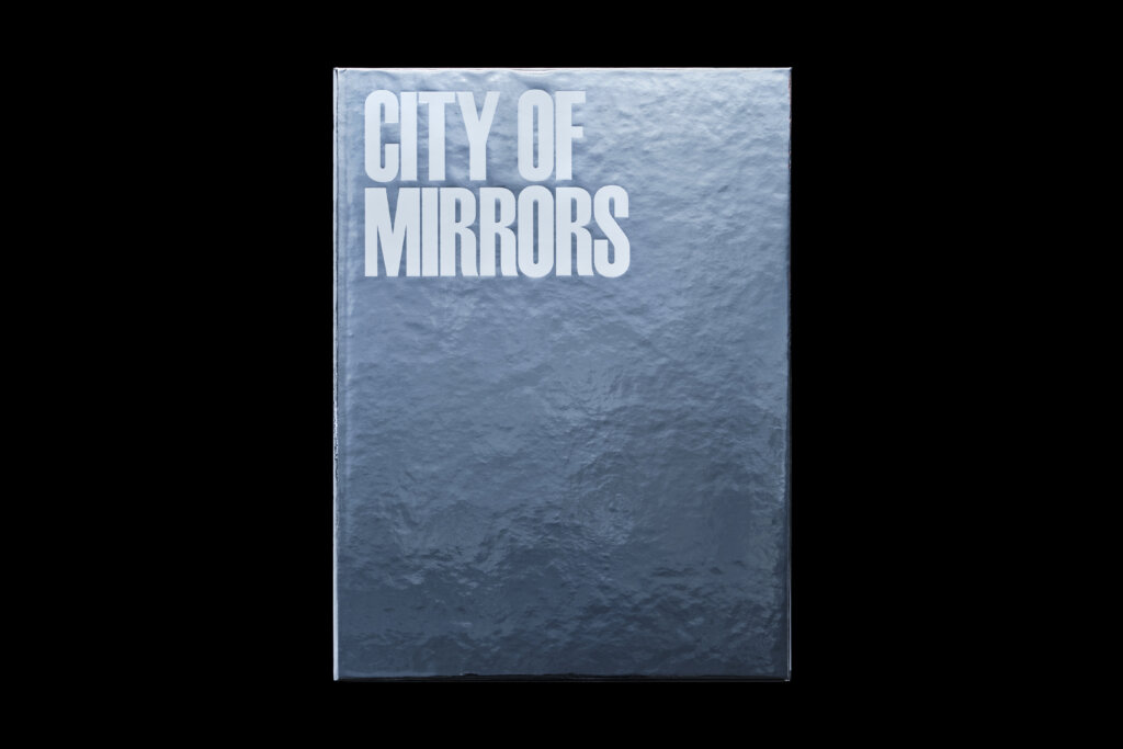
With its metallic silver paper wrapping hardcover board, the book’s cover is reminiscent of a skyscraper, a vertical landscape housing fleeting impressions
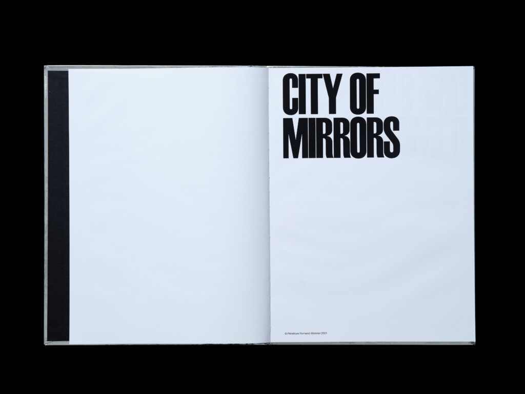
Inside the book, the typeface Schmalfette was employed for its bold but quirky characteristics, much like Manhattan’s climbing skyline
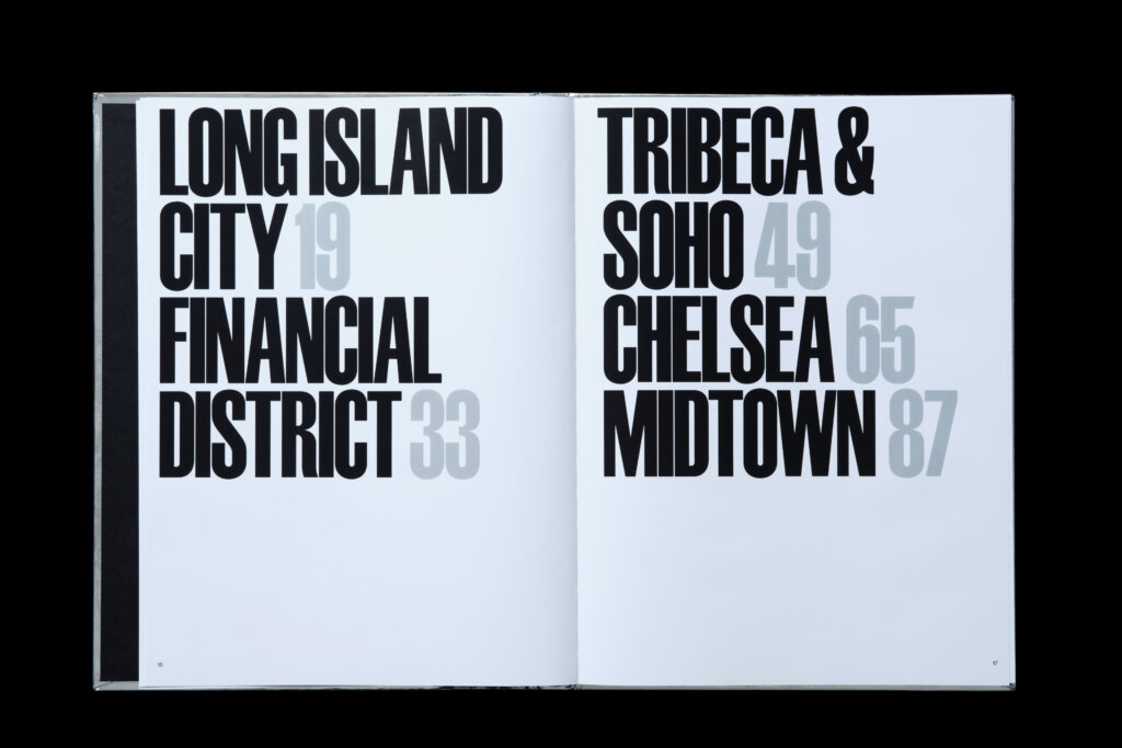
The book is organized by neighborhood
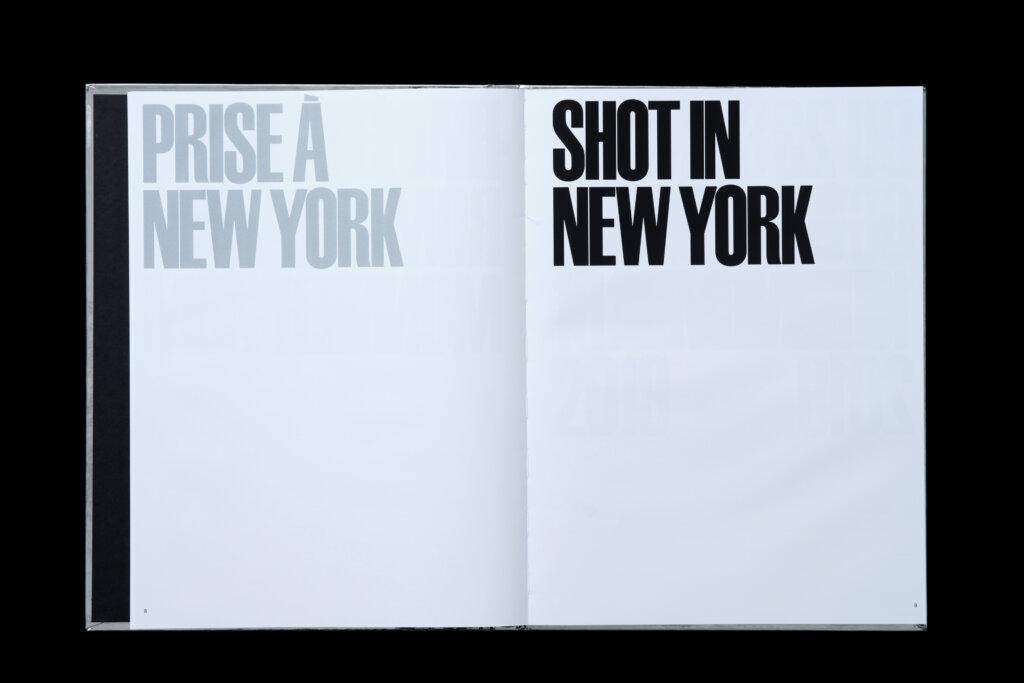
Texts are typeset in both French and English throughout
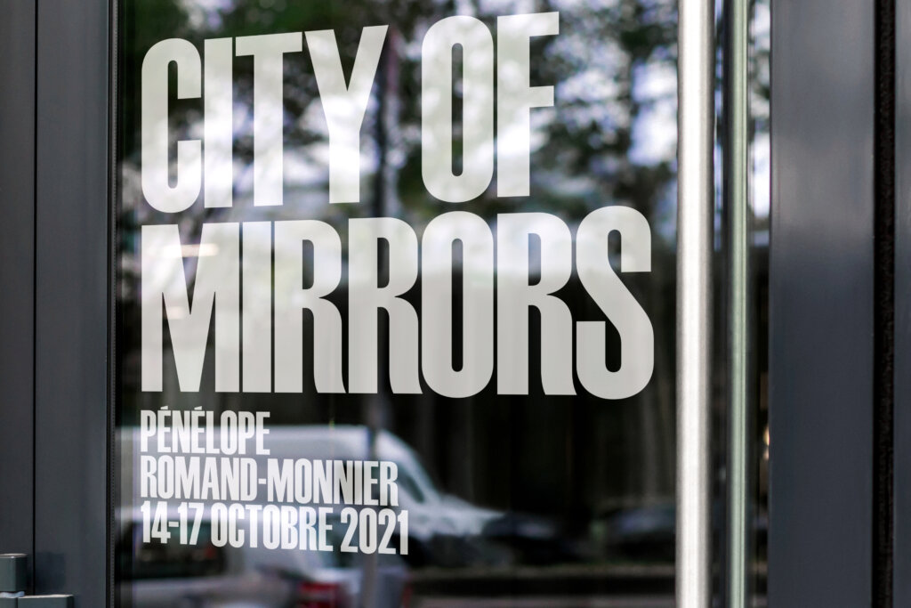
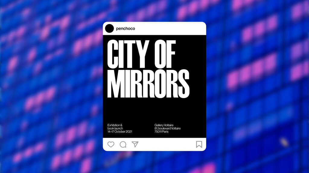
The exhibition’s typographic identity mimics that of the book’s and was used in gallery signage, posters, and digital/social media applications
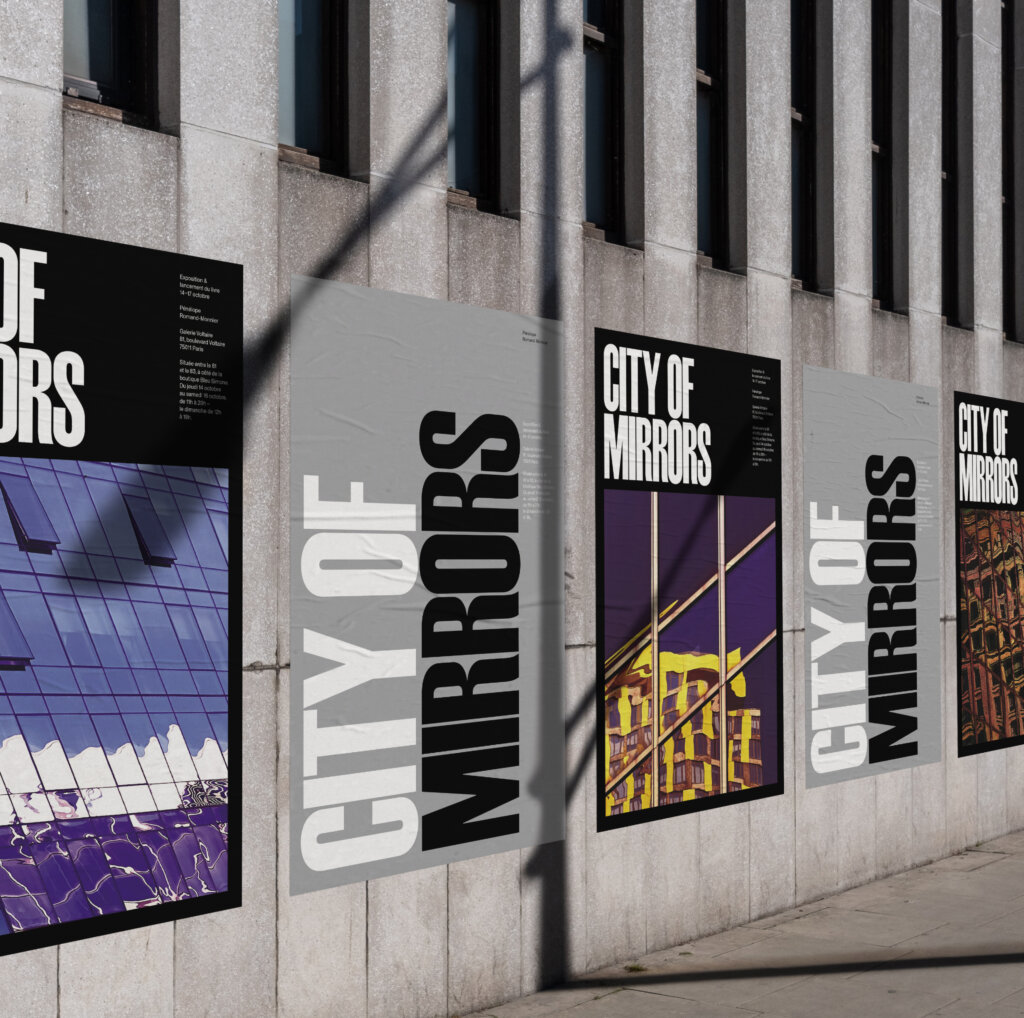
A series of OOH exhibition posters

Project team
Aron Fay
Will Ferguson
Client team
Pénélope Romand-Monnier
Product photography
Brian Kelley
Type design
Jeremy Mickel
Commissioned by Michael Bierut