
KAYAK
Infographic system and guidelines
KAYAK, a premiere travel booking website, provides its consumer-base with competitive deals on airfares, hotels, rental cars and other travel-related services. In 2019, the industry giant approached FAY to create a design system for how they visualize data across their entire business, including website. After a robust audit of the company’s branded materials—it became clear KAYAK isn’t just in the business of travel company, it’s in the business of data.
FAY created a robust, unifying data visualization system for the brand, that on one hand embedded more brand personality into their data visualizations—and on the other—ensured that users were able to quickly make decisions about travel plans, based on simple, easy-to-parse, data visualizations.
As a starting point for data visualization design, FAY employed the KAYAK logo’s Solari board motif. From there, a system was developed allowing for multi-dimensional data sets to be represented in either two or three dimensions—the latter allowing data to come to life as interactive animation or motion graphics. The final delivery included a strategic reassessment of KAYAK’s data visualizations, site layouts, front end design elements, across-business marketing efforts and comprehensive guidelines for visualizing data, whatever the domain.
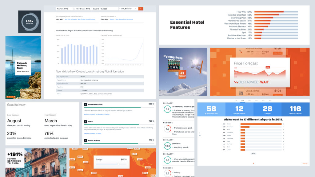
Overview of previously used infographics

An overview of the new, amplified data visualization system
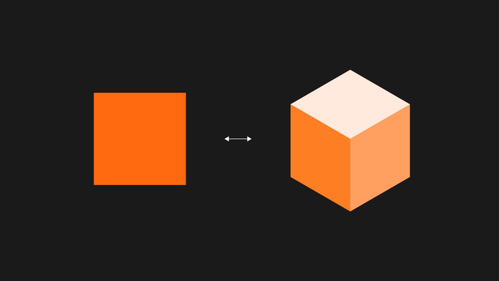
2D and 3D data visualization style, grounded in the rigor and order of KAYAK’s square Solari board motif
Loading animation shows 3D data blocks on the move
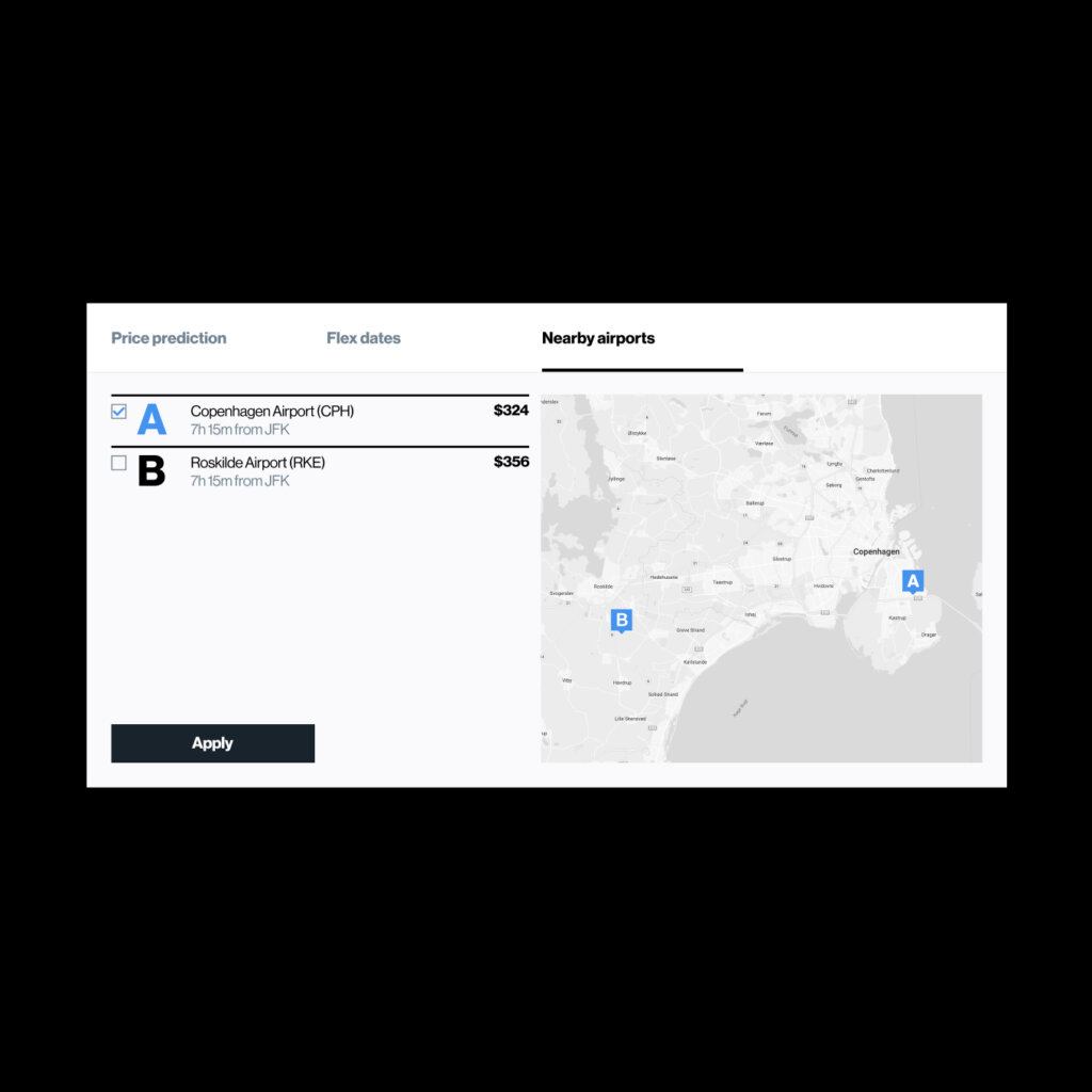
The square doubles as an organizational tool, structuring dashboards to group and arrange location-based data in a way that’s easy to digest
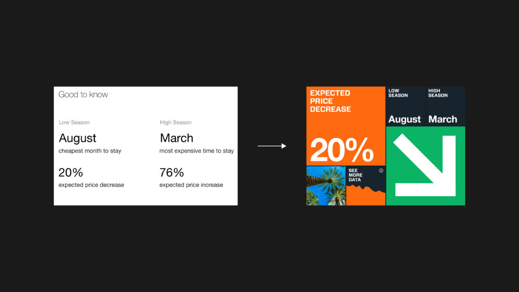
Select data visualization strategies outlined in FAY’s guidelines document
Forget flight risks. No data is lost in KAYAK’s new dashboards, shown here on a sample flight query page
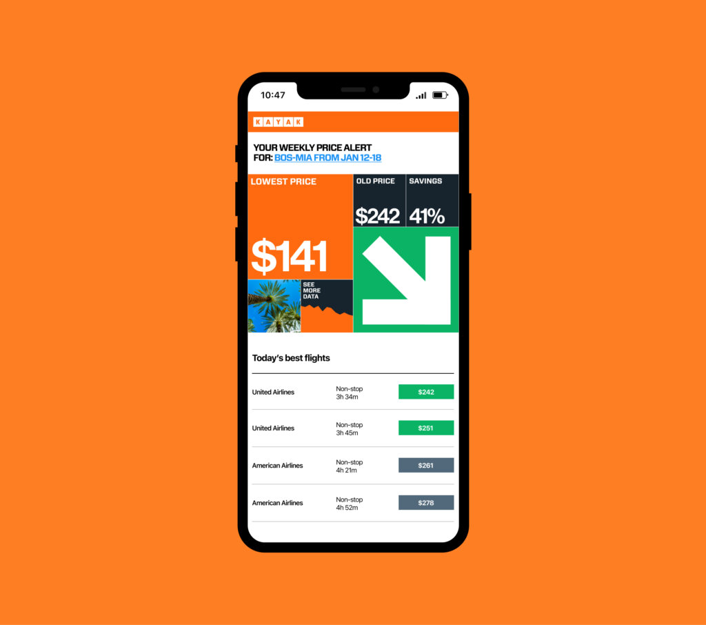
The dashboard system in use for email notifications

The graphic system extended to KAYAK’s annual Hacker Guide

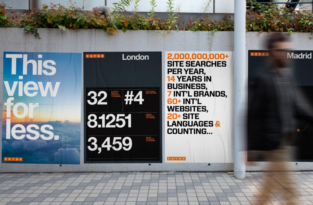
The square, a simple and democratizing motif, lends itself easily to the creation of time-based infographics
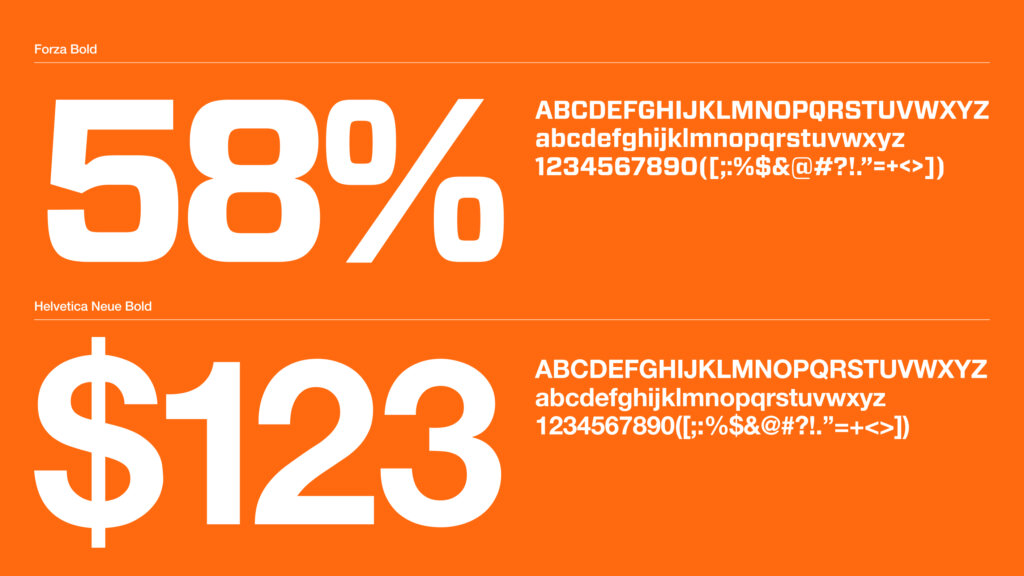
A recalibration of KAYAK’s type styles across the brand, increasing legibility
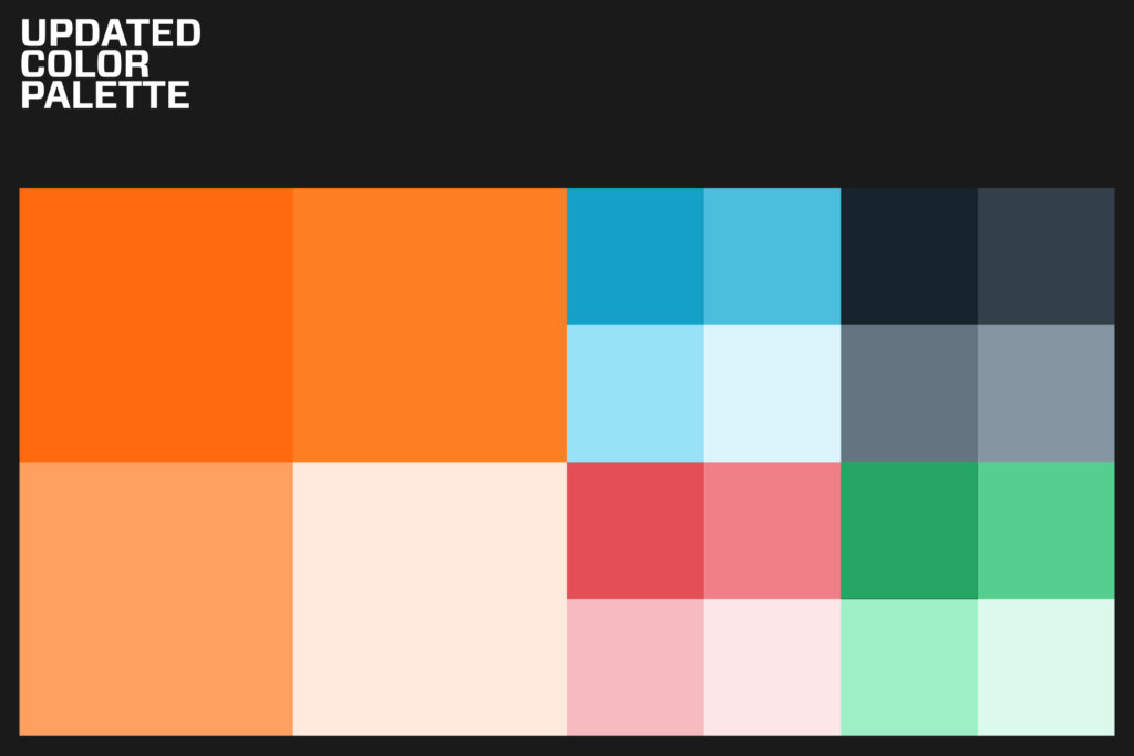
An expanded, recalibrated color palette for use across the visualization system
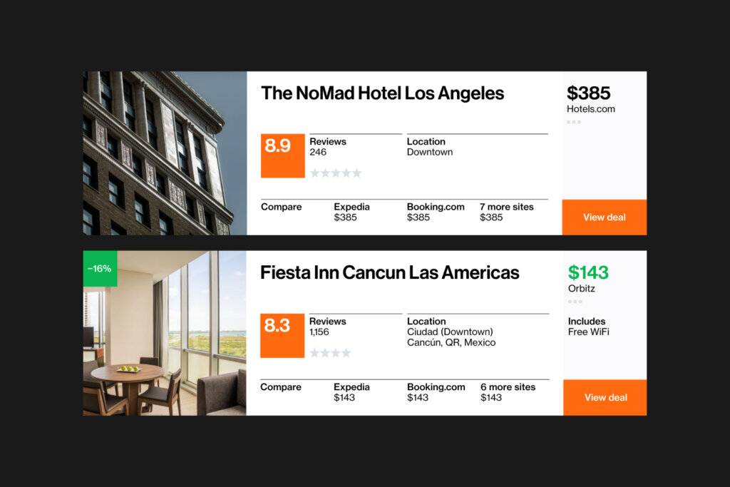
Rating system and redesigned content organization strategy for the web
Simple data visualizations take flight—and engage users—via subtle animations
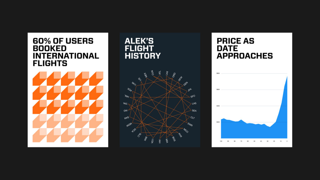
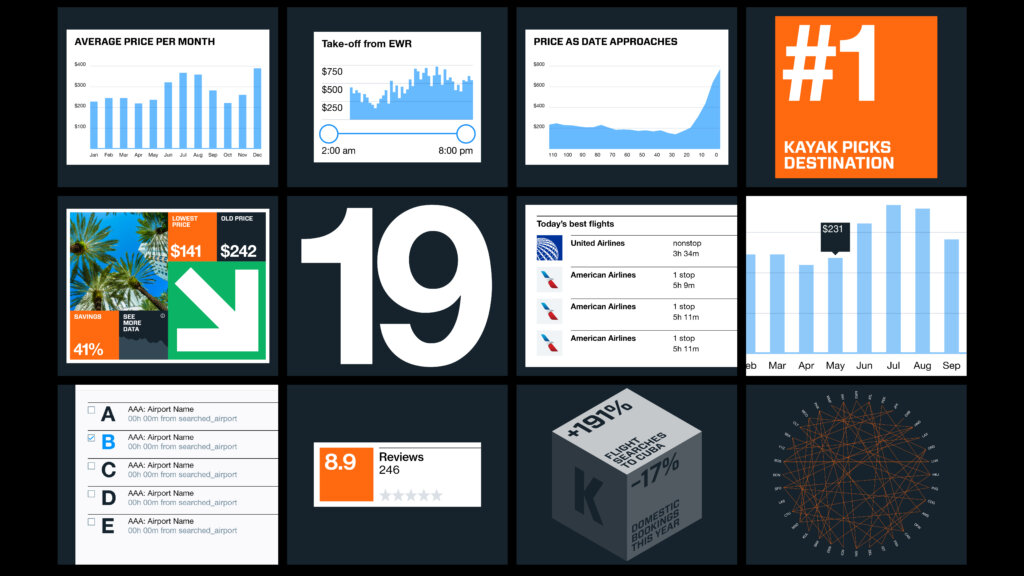
An example of a few expressive data visualization types included within the system
Simplified map system, making destinations easier to locate
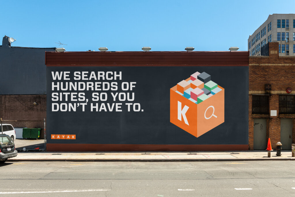
The existing block motif, expanded and paired with new photography recommendations
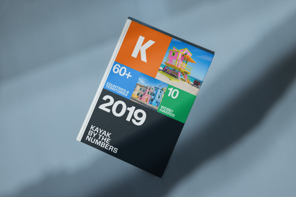
Data is at the core of KAYAK’s business. This example annual report reflects that, elevating data to its core theme

Swag embracing data as a storytelling device
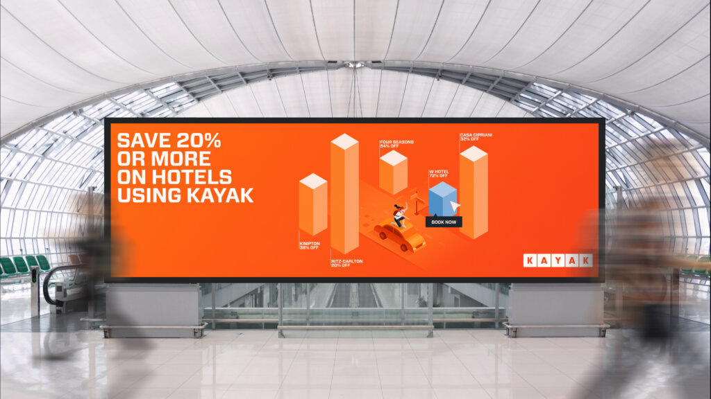
The 3D data visualization system used with KAYAK’s established isometric illustration style
The work was codified in a comprehensive set of strategic and visual guidelines for national use
Project team
Aron Fay
Will Ferguson
Chi Hao Chang
Client team
Aleks Safarova
Laura O’Connell
Charde Fuller